A Logo, aside from being part of a 'Brand' is also a way of communicating symbolically.
Our logo was, in that vein, designed to communicate different messages as well.
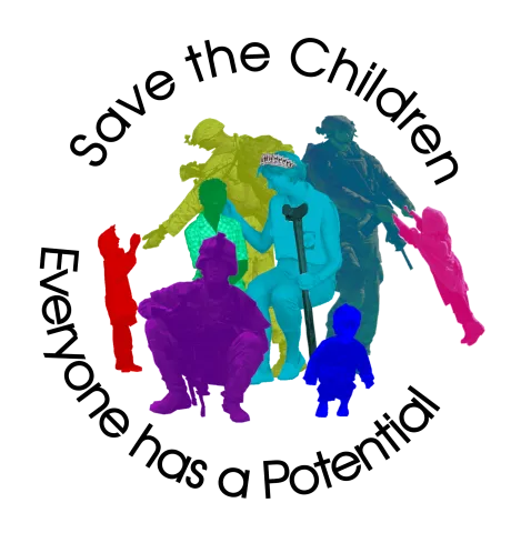
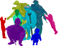
At the center of the Logo is Diana directly interacting with a young woman who has lost a leg from land mines. Lady Diana was always very active with people she interacted with through her humanitarian work. Breaking the barriers of class and privilege, Diana would often touch those who were suffering in order to reassure and comfort them, even in cases where they were suffering from diseases that are communicable and stigmatized such as was the case with people she visited who suffered with AIDS and leprosy.

In her interaction with this young lady, she is physically carrying her crutch, almost as if to lighten her burdens or address her distress directly.
Lady Diana is wearing a crown, as she was, and continues to be, Lady Diana, Queen of our Hearts.
Surrounding her are military forces who are central in finding and saving men, women and children from the scourges of human trafficking and slavery. Seeing men and women in uniform, because of various cultural programs and moments in history, can be emotionally jarring to some, and the intention here is to paint a different picture altogether. In this logo, members of the Armed forces, who are working tirelessly against horrendous forces and often at the risk of their lives, are seen interacting with the very children they were instrumental in saving from harms way. These interactions are joyful, respectful, nurturing and derived from actual photographs.
The logo is as playful and colorful as the dear children we are saving from harms way, and they are meant to represent all colors of humans - a word which itself connotes the many hues of man (hue-man) - from all sectors of the earth.
It also resembles the form of a rose, with petals of many colors.

When used as a brand for the products in OUR STORE, the logo is surrounded (but not completely), by our name and our primary message/slogan - Everyone has a potential.
The Child being swung by the brave and playful Guardian is coloring outside the lines of the circle, being playfully guided beyond the barriers of the Logo Brand. In reality, these operations free the survivors from the bonds of the life they had been absconded into. This Guardian is swinging her, and indeed all of us, beyond the Bubble of what we think is possible.
One child is handing the uniformed Guardian some food, symbolizing trust and nourishment. Another is sitting next to a traumatized boy, not forcing an interaction, but just staying near. Letting the boy know he is safe, and that he can choose his own personal space, and that this space will be respected.
The trust and respect is clear in all interactions. This is a call to all of us to look inside and model these exchanges and principles.
